Final Draft Analysis
 Masthead

I have kept the masthead the same as I feel that it is effective and
eye-catching. I like the name 'The Examiner' as I feel that many
students will be able to relate to this. I have kept the same layout
and font, which is located underneath the header footer.
Main Image

I have changed the main image and decided to use a sixth form student as I believe that it would seem more attractive to teenagers and not just looking like a normal school magazine as they are wearing their own clothing. I have still decided to use a female student wearing minimal make up and jewellery to set a good example to many students in the younger years. I would preferably like to use a student with blonde hair as it goes with my colour scheme of yellow, black and red.
Pug
 I have not changed the style or placement of my pug as I feel that is effective and matches the colour scheme I have chosen.
 Header and Footer Bars

I have not changed my bars at all as I believe that I have used them effectively and have included good titles that could potentially attract readers.
Sell Lines
 I have not drastically changed my sell lines and have only added to the amount. I originally had five and now my final draft has six. I added another sell line to add more of a range of topics to attract many readers with different interests. I have used to same colour scheme as I believe it is very effective and works well as well as being very eye-catching.
Splash
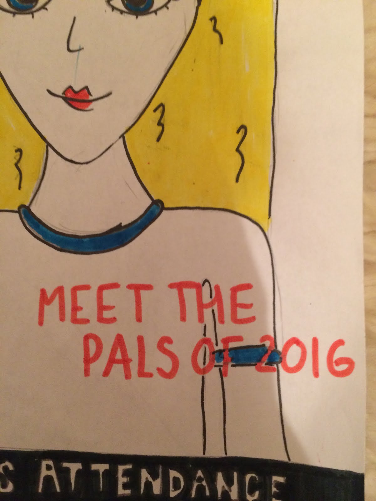 I have changed the splash to have a relevance to my main image. I have decided to use the splash, 'Meet the Pals of 2016' as new sixth formers have volunteered to help the younger students. I think that this splash is effective as if they need advise or help they know who could possibly help them.
I have used the same colour scheme as I believe that it stands out and matches my colour scheme as it is red font.
Subsidiary Image
 I have decided to add a small subsidiary image to fill dead space and to also add a recognisable image for readers. I have chosen the school emblem which is also sewn onto the school uniform. The colours used are yellow and black which are also two of the colours I have chosen to use.
 Extra detail
 I have added small additions to my magazine to make the magazine look fairly realistic. I have included the date of the magazine and also the issue number which is clearly the first.
 Final Draft
In my opinion, I think that this deign looks eye-catching and well presented. I believe that the colour scheme is good as the yellow and black match the schools colour scheme. I think that the changes I have made do not change the layout but make the magazine better in that it includes more detail.

Excellent evidence of drafting, Nia.
ReplyDelete