Friday, 16 December 2016
Friday, 9 December 2016
School Contents Page

For my contents page, I have used a basic design layout. I have carried the colour scheme of my front cover to my contents page which includes the schools colour scheme of black and yellow as well as the bold red which compliments the vibrant yellow. Overall, I am pleased with the outcome as the information is able to read and my photographs relate with my front cover such as the bottom image revealing the GCSE results.
Sunday, 4 December 2016
The Contents Page- Questions
The Contents Page
Questions
1.What is the function of a contents page?
The function of a contents page is to give readers an understanding to what is featured in the magazine. Reading a magazine in a non-linear process is not usual for us to do, therefore the contents page helps the reader to choose which articles they are interested in and articles they have no interest in. The contents page has page numbers present alongside a description or an image to allow the reader to identify which articles they wish to read.
2. How does the reader use the contents page?
A contents page is located at the front of the magazine and is most common after the cover page. The reader can use this to select which articles they wish to read, therefore will look at the page number and will be able to find the page. The contents page allows to reader to select the certain articles they wish to read and have a larger interest in.
3.What is the conventional layout/design for a contents page in a magazine?
The layout of a contents page is commonly set out in columns. There is usually one main image which relates to the main article inside the issue. There are also subsidiary images relating to other articles in the issues. The masthead 'contents' and the issue number are commonly located at the top if the contents page. The colour scheme is usually similar to the cover page using the magazines house-style.
4.How much information does a contents page contain?
The contents page will only include the most relevant information for the articles inside. Page numbers are located next to the relevant information or images. There is a small summary underneath the subheadings of the articles and gives the audience an understanding of what is included inside the article.
5. How are images used in a conventional contents page?
On the contents page, images are used to relate an article to the subject and readers will often find the page number of the article near the image and subheading whether is is an image of a band/artist or even equipment.
Thursday, 10 November 2016
Analysis Task- 'The Gaslight Anthem'
Question One:
- The band was born in New Brunswick, New Jersey
- The front man and main song writer is Brain Fallon
- Their second album is called '59 Sound
- The album includes mixes of soulful punk rock with vivid sketches of small town dreamers
- In the area they grew up in there was a 'disparity of wealth.' Ranging from drugs and burning buildings to $4 million properties a block or so away
- Inspired by Bruce Springsteen, who also had the same up bringing
- The music is originated from their working class backgrounds
- Fallon practised the guitar for 8 hours a day as a child, and skipped school
- Fallon learn't from his parents who worked hard
- The band formed in 2005
Question Two:
New Brunswick, New Jersey is not the most wealthiest area and contains boarded-up houses and derelict factories and the air of an industrial ghost town. There are also gangs of tattooed teenagers in 'wife beater' vests and oversized trousers glowing menacingly on street corners.
Question Three:
Lead singer Fallon enjoys listening to Elvis Presley and Roy Orbison since he had his Sony Walkman when he was only a child. Fallon learn't from his parents and respects his mother due to their close relationship who has always been proud of her son and and his progress of learning the guitar but was since criticised he learnt to push boundaries with the law. He dislikes not being busy, potentially because he feels worthless if he doesn't make any contribution
Question Four:
Brian Fallon grew up in a run down area of New Jersey, the next state to New York, and has learnt from the menacing nature of his hometown . He as a close relationship with who is proud of her son's guitar skills. He was refused by higher education and decided to push his music career.
Question Five:
Brian Fallon teaches his readers that we don't have to be academically smart to determine our careers and that determination is the key to success. This is taught through his period of learning the guitar. He also believes that our background will not affect how we are perceived if we focus and work hard for what we love and wish to pursue. He was inspired majorly by his parents hard work and determination and has learn't to work as hard as you possibly can as it can can all be over anytime.
Question Six:
At the end of the article, Fallon refers to The Clash as he believes that 'This generation is about instant gratification.' this connotes that in the present day we don't graft our ideas, we are only doing as little as we can and want praise for this. Fallon dislikes this potentially because it requires little care and effort.
Saturday, 8 October 2016
Friday, 7 October 2016
School Magazine Development and Commentary
Masthead
 I decided to call my magazine 'The Examiner' to relate to pupils as they will all sit exams in their secondary school life. I stuck to my colour scheme of yellow and black as they are the school colour scheme. I also believe that they stand out well and also compliment each other due to the bright, vibrant yellow against the dark, bold black.
Main Image
 My main image covers most of the magazine cover. I took a photograph of a Sixth Form student called Megan. She represents the Sixth Form students at the school due to wearing her school 'student' lanyard around her neck. After taking this medium shot, I removed the background to make it seem like a professional as it makes it seem simple yet effective.
Subsidiary Image
 I used the school logo as a subsidiary to relate the school as well as filling dead space. I used this logo as it relates to the colour scheme of the magazine as well as making it look professional.
Sell Lines and Pug

 I used the same sell lines as I planned in my draft and believe that it works well on the magazine due to the red and black font used. As well as my pug, I stuck to my draft and overall I am pleased with the outcome and thick that it works well with my colour scheme.
Splash
The splash covers the bottom of the main image and overall I am pleased with the outcome. I have made a change to the colour as the red was not particularly noticeable, therefore I changed it to yellow and black to match the schools colour scheme and to make it match the school emblem.


Header and Footer bars
I have not made any changes to the header and footer bars as I believed that they were effective on the magazine.
Final Magazine Cover
Overall I like the magazine cover I have designed and believe that I have included important features such as the splash and main image. I believe that it is vibrant and eye catching. Also that the text is visible and simple to read.

Friday, 30 September 2016
Final Draft Analysis
Final Draft Analysis
 Masthead

I have kept the masthead the same as I feel that it is effective and
eye-catching. I like the name 'The Examiner' as I feel that many
students will be able to relate to this. I have kept the same layout
and font, which is located underneath the header footer.
Main Image

I have changed the main image and decided to use a sixth form student as I believe that it would seem more attractive to teenagers and not just looking like a normal school magazine as they are wearing their own clothing. I have still decided to use a female student wearing minimal make up and jewellery to set a good example to many students in the younger years. I would preferably like to use a student with blonde hair as it goes with my colour scheme of yellow, black and red.
Pug
 I have not changed the style or placement of my pug as I feel that is effective and matches the colour scheme I have chosen.
 Header and Footer Bars

I have not changed my bars at all as I believe that I have used them effectively and have included good titles that could potentially attract readers.
Sell Lines
 I have not drastically changed my sell lines and have only added to the amount. I originally had five and now my final draft has six. I added another sell line to add more of a range of topics to attract many readers with different interests. I have used to same colour scheme as I believe it is very effective and works well as well as being very eye-catching.
Splash
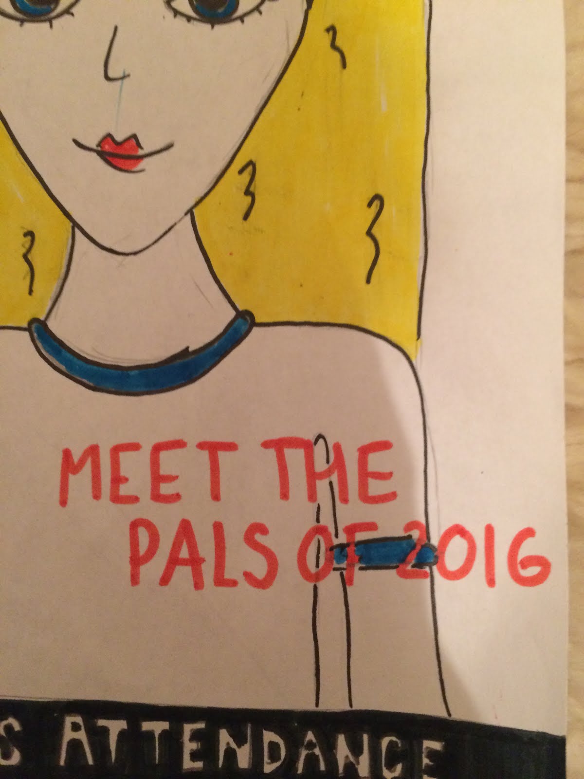 I have changed the splash to have a relevance to my main image. I have decided to use the splash, 'Meet the Pals of 2016' as new sixth formers have volunteered to help the younger students. I think that this splash is effective as if they need advise or help they know who could possibly help them.
I have used the same colour scheme as I believe that it stands out and matches my colour scheme as it is red font.
Subsidiary Image
 I have decided to add a small subsidiary image to fill dead space and to also add a recognisable image for readers. I have chosen the school emblem which is also sewn onto the school uniform. The colours used are yellow and black which are also two of the colours I have chosen to use.
 Extra detail
 I have added small additions to my magazine to make the magazine look fairly realistic. I have included the date of the magazine and also the issue number which is clearly the first.
 Final Draft
In my opinion, I think that this deign looks eye-catching and well presented. I believe that the colour scheme is good as the yellow and black match the schools colour scheme. I think that the changes I have made do not change the layout but make the magazine better in that it includes more detail.

Thursday, 22 September 2016
Draft Cover Analysis
Masthead
 I have named my school magazine 'The Examiner' as it is directed towards students aged 11-18 years old, therefore everyone will experience exam life as well has being able to relate to it. As the photograph shows, the masthead is located in the top left hand side of my magazine cover underneath the header. I used the colour scheme of black and yellow as it is the school uniform colour scheme. I have used different fonts as I believe that it is effective and is eye-catching and easy to read.
 Main Image
 The main image is the main focus of my magazine cover.This drawing idealistically would represent a year 7 pupil wearing the correct school uniform which is shown in the image.The student will wear a black blazer with the school emblem embellished on the pocket, an optional black jumper, a white shirt, and the yellow and black tie. The pupil would preferably be a female with dark hair as think that it could possibly make the image stand out rather than lighter hair which doesn't stand out as much. The pupil should not have noticeable make up on as it does not show the pupils true identity and age. I think that using a photograph of a year 7 pupil would be important as it is the main story as the new school year begins, as well as it being their first year at King Henry VIII.
 Pug
 The pug is located on my magazine on the right hand side. It is incredibly simple and i have used the same colour scheme as my masthead. I have included the title, 'Record Breaking GCSE Results 2016' to celebrate last Year 11's results which have also been the best results the King Henry has ever achieved.
 Header and Footer Bars

 I have included header and footer bar to add extra information which also borders my magazine, making it look professional and and clean. my header bar reveals '5 Revision Tips' to draw readers which could potentially starting exams in a dew months and to help them achieve their goals.
My Footer bar includes the line 'Headteacher Praises Attendance' which is extremely important for Mrs Lewis. I have used the colour scheme black and white as it is bold and still ties in with my colour scheme.
Sell Lines
 I have included 5 sell lines to accommodate a range of readers and to interest many. For example, I have included the line, 'Q&A with Mr Evans' which can accommodate pupils which like gossip magazines. I have also included sell lines such as 'art club re-opens it's doors.' This is to cater to students which are interested in these activities.
I have used the colour scheme red and black as they are the most used colours in magazines due to being bold and eye-catching.
Splash
 The splash is the main sell line which can overlap the main image and is used to draw readers in. My splash line is 'KHS Welcomes Year 7 2016,' This is due to the new academic year begging and to tie in with my main image.
Overall Cover
Overall I am pleased with the
outcome as I have included
many important aspects of a
magazine such as the masthead, splash,
and a pug. I believe that my School Magazine
cover is eye-catching, organised and
includes key information.
Subscribe to:
Comments (Atom)